Case Study
VarioGuide
A fullscreen intraoperative wizard for Brainlab's cranial navigation software, guiding surgeons through high-precision trajectory alignment one joint at a time, with real-time visual feedback readable from across the operating room.
- Company
- Brainlab
- Role
- Lead UX Designer
- When
- 2021
- Domain
- Medical Device / Regulated Software
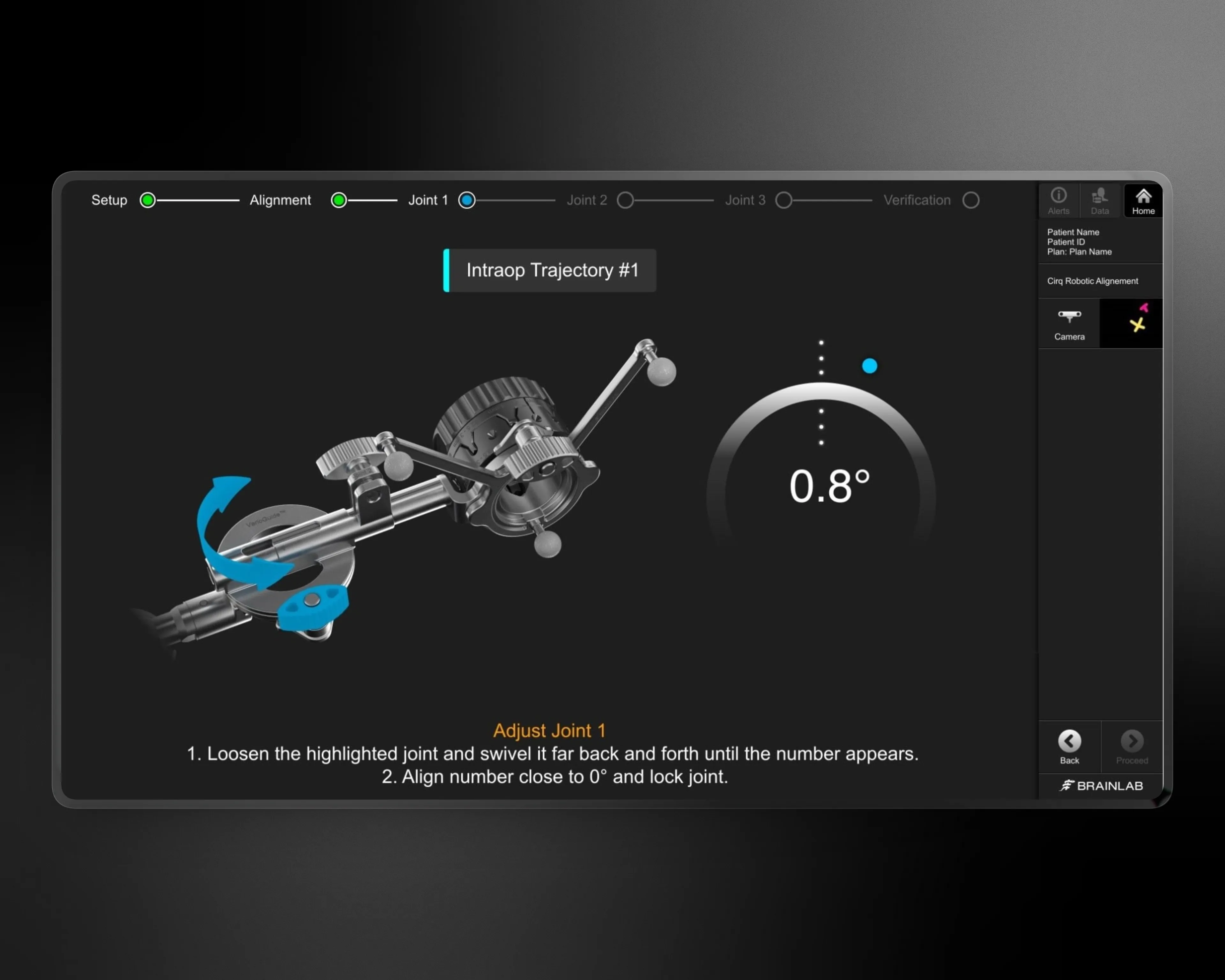
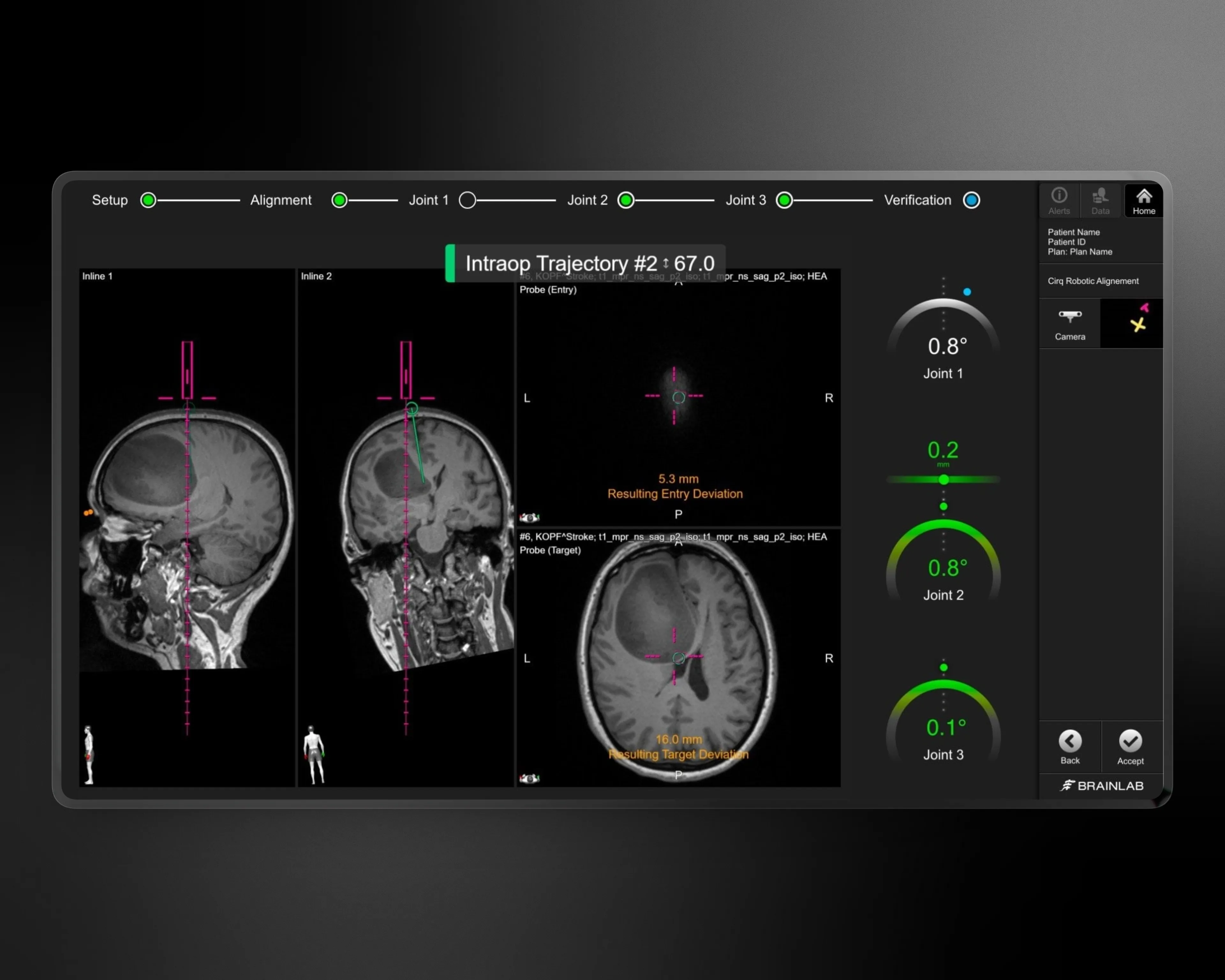
Redesigned the instrument alignment dialog for Brainlab’s cranial navigation software. Defined a step-by-step intraoperative workflow with real-time visual feedback that guides surgeons through high-precision trajectory alignment during brain surgery.
Overview
VarioGuide is a frameless instrument alignment system used during cranial procedures to target pre-planned trajectories — guiding surgical instruments to exact positions inside the brain. The alignment process requires an operator to manually adjust multiple joints on a mechanical arm while monitoring precision readings on a screen.
I redesigned the alignment dialog within Brainlab’s cranial navigation software, triggered by a hardware refresh that required updated 3D renderings. What started as a rendering update became a full rethink of the alignment flow — from a cluttered windowed dialog to a focused, fullscreen wizard with novel real-time feedback elements. Working with a UX engineer, I led the design from requirements gathering through wireframes, Adobe XD mockups, user testing, and developer handoff.
The Team
Brainlab is a research-heavy environment. Each project had a dedicated design research team running studies and synthesizing findings, an in-house testing facility where practicing medical professionals would come in for hands-on sessions with pre-release software, and regular field visits to observe the tools being used in real hospitals. Day to day, design work paired a UI designer and a researcher — typically a team of two, with adjacent specialists pulled in as needed. On VarioGuide that pairing carried the project from requirements gathering through developer handoff.
Problem
The existing dialog presented the entire alignment process in a single windowed view with distracting content visible behind it. Operators had to mentally parse which step they were on while simultaneously managing a physically demanding task — loosening, rotating, and locking joints on a mechanical arm attached to the patient. Feedback for joint alignment was difficult to read at a glance, which mattered because operators often stood several feet from the screen while physically manipulating the instrument. There was no clear progression through the multi-step process, and no indication of whether a joint was close to its target or far off. In a surgical environment where precision is measured in fractions of a degree, the interface added cognitive load instead of reducing it.
Solution
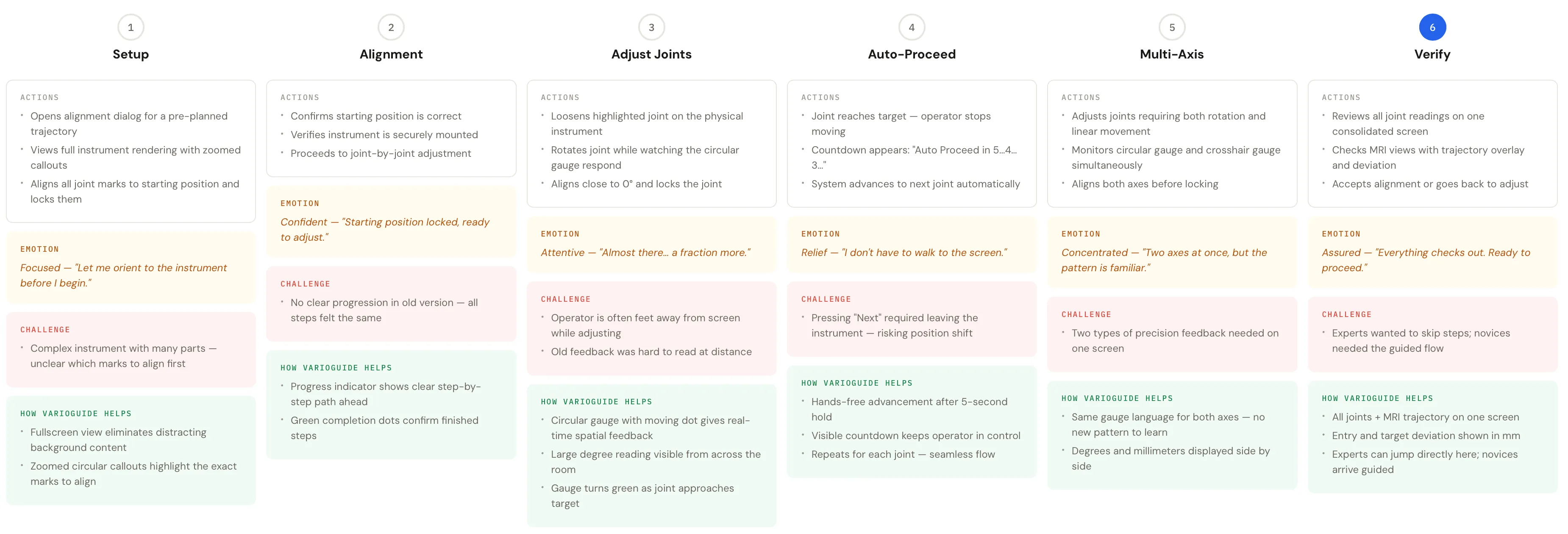
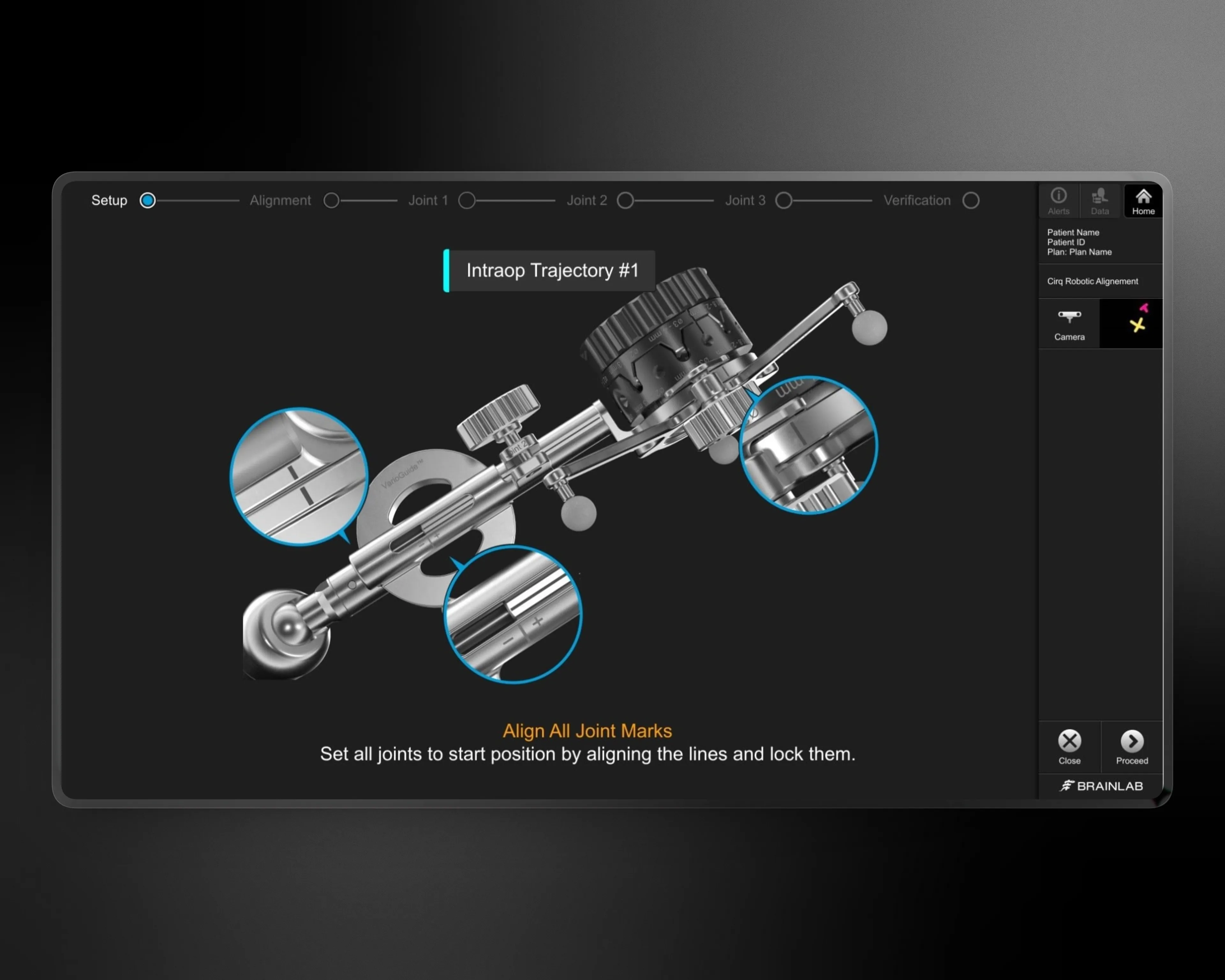
I designed a fullscreen, step-by-step wizard that isolates each phase of the alignment — Setup, Alignment, Joint 1, Joint 2, Joint 3, and Verification. Eliminating background content focused attention on a single task at a time, with clear progress indication at the top.
For real-time feedback, a novel circular gauge tracks the joint’s current position on an arc paired with a large degree reading in the center. The gauge transitions from neutral to green as the joint approaches its target, giving immediate spatial feedback without requiring the operator to read numbers precisely — readable from several feet away.
Pressing an on-screen button is impractical when your hands are on the instrument, so an auto-proceed advances the system once a joint is aligned and the operator stops moving for five seconds. No more walking back to the screen between each joint adjustment.
For experienced operators, the Verification screen consolidates all joint readings, MRI trajectory overlays, and inline views into a single page. Advanced users can skip directly to it and adjust from there, while the step-by-step flow guides less experienced users.
Project Goals
The redesign needed to reduce cognitive load during a high-stakes surgical procedure while maintaining the precision and control that surgeons depend on. The interface had to work for operators physically removed from the screen, often with gloved hands occupied by the instrument.
Provide distance-readable feedback
Reduce alignment errors with clear real-time visual feedback for each joint adjustment, readable from several feet away.
Eliminate unnecessary screen interaction
Operators stay focused on the instrument and patient during alignment.
Support novice and expert workflows
Guided step-by-step for new users; consolidated overview for experienced operators.
Key Design Decisions
Fullscreen Dialog Over Windowed Overlay
The previous version ran as a windowed dialog with the main navigation software visible behind it, creating visual noise during a procedure that demands total focus. Moving to fullscreen eliminated distractions entirely. It was a deliberate trade-off — operators couldn’t access other navigation views during alignment — but in user testing, they confirmed that during alignment, they need nothing else on screen.
Circular Gauge for Real-Time Joint Feedback
The previous feedback mechanism was difficult to read at a distance. The new circular gauge tracks the joint’s current position on an arc, paired with a large degree reading in the center. As the joint approaches 0°, the gauge transitions to green. In user testing it performed significantly better than the previous version because it gave both spatial feedback (how far am I from the target?) and precision feedback (exactly how many degrees off?) simultaneously, readable from across the room.
Auto-Proceed After Alignment
Operators frequently had to step away from the instrument to press “Next” on screen — an awkward interruption that broke focus and could disturb the instrument position. The five-second auto-proceed advances the system once the joint is aligned and motion stops, with a clear countdown indicator. This respected the physical reality of the operating room where the screen isn’t always within arm’s reach.
Consolidated Verification View for Expert Users
Rather than forcing experienced surgeons through every step sequentially, the Verification screen shows all joint readings, MRI trajectory overlays (entry and target deviation), and inline views simultaneously. Advanced operators can jump directly to this screen, while the step-by-step flow serves as guardrails for less experienced users. This dual-path approach avoided the common trap of designing only for one expertise level.
UI Design
This is intraoperative software, used during active surgery. Every decision prioritizes clarity and error prevention. The dark background isn’t an aesthetic choice — it matches the dimmed lighting of an operating room and reduces screen glare on surgical fields. High-contrast elements (cyan highlights, green confirmation states, white text) ensure readability in those conditions.
The operator’s primary attention is on the physical instrument, not the screen. Visual hierarchy is extreme: the 3D rendering occupies the center, the gauge and degree reading are sized for distance viewing, and instructional text at the bottom is kept to one or two short sentences. No secondary navigation, no settings, no menus to accidentally trigger.
A simple node-and-line progress indicator at the top with green completion states is instantly readable — the operator always knows which step they’re on and how many remain. For Joint 2, which involves both rotational and linear motion, the screen presents both a circular gauge and a linear crosshair gauge simultaneously, using the same visual language so the operator doesn’t need to learn a new pattern mid-procedure.
Learnings
- In surgical software, removing features is more valuable than adding them — every element that isn’t essential is a potential distraction in a life-critical environment.
- Distance readability should be a first-class design constraint for any interface where users aren’t sitting at a desk — the circular gauge succeeded because it was designed for the room, not just the screen.
- Auto-proceed is a powerful pattern for hands-busy workflows, but it requires careful timing and clear visual indication — operators need to feel in control even when the system advances automatically.
- Designing for two expertise levels (guided and expert) within the same flow avoids forcing a choice between safety and efficiency.
Impact
The redesigned alignment dialog ships as part of Brainlab’s cranial navigation software, used in operating rooms worldwide for frameless biopsies and other cranial procedures. The step-by-step wizard pattern established a reusable framework for other multi-step intraoperative dialogs within the Brainlab platform.