Case Study
Maxtel
Five separate web apps consolidated into one cohesive restaurant management platform for McDonald's franchisees in New Zealand. Delivered as responsive HTML and Tailwind prototypes that served as the visual and interaction reference for the production rebuild.
- Company
- McDonald's New Zealand (via Toptal)
- Role
- Senior UX Designer
- When
- 2022
- Domain
- B2B SaaS / Enterprise / Multi-site
Consolidated 5 separate web applications into a single, cohesive management platform for McDonald’s franchisees. Defined the information architecture, design system, and interaction patterns across scheduling, employee management, HR requests, and messaging — delivered as responsive HTML and Tailwind prototypes that served as the design reference for the production build.
Overview
Maxtel is a back-office management platform used by McDonald’s restaurant franchisees in New Zealand for scheduling, employee management, HR requests, messaging, and reporting. Over 35 years, the product had grown into 5 separate web applications — each built at different times, with different interfaces and interaction patterns. Franchisees and restaurant managers had to switch between apps constantly, relearning navigation and visual language each time.
I was engaged directly to redesign the entire suite as a single, consolidated web application. The brief had two goals: simplify the daily experience for restaurant managers, and establish a design system the team could apply consistently going forward. I delivered the redesign as responsive HTML and Tailwind CSS prototypes — testable on every device and dense enough with real markup to serve as the canonical visual and interaction reference for the production build. The project ran three months from first conversation to final handoff.
The Team
Maxtel was deliberately a smaller engagement than the enterprise work elsewhere in this portfolio. My primary collaborator was the product owner — direct, decisive, and accountable for the outcome — with the developer joining when implementation questions surfaced. Three months from kickoff to handoff is only possible at that team size; bigger committees would have eaten the timeline.
Problem
McDonald’s restaurant managers are operationally busy — managing shift coverage, handling employee requests, sending communications, and tracking compliance across locations, often from the restaurant floor. Maxtel’s tools supported all of these workflows but spread them across 5 separate web applications with no shared navigation, inconsistent visual language, and different interaction patterns. Switching between Scheduling and Requests meant loading a different app with a different layout. There was no unified view of an employee — their schedule lived in one place, their requests in another, their profile in a third.
For the company, this fragmentation also created a maintenance burden: every app had its own UI patterns, making updates slow and inconsistent. The development team needed a design system they could own and extend — not a one-off redesign that would diverge over time.
Solution
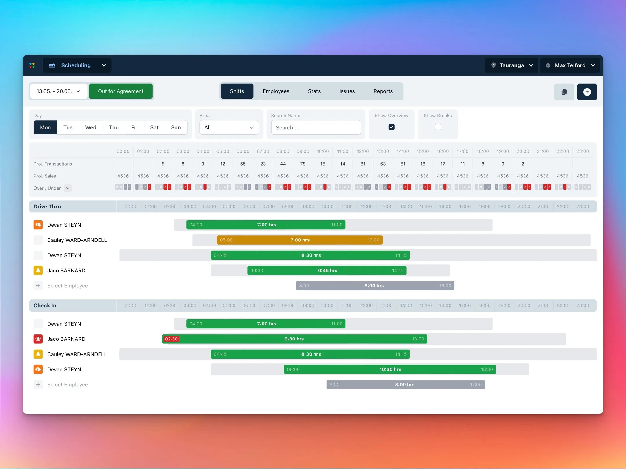
I designed a unified platform with a persistent top navigation that connects every module — Scheduling, Self Service, Requests, Messaging, and more — through a single application shell. The module switcher in the top-left provides instant context switching without page reloads, and the location and user context (top-right) persist across all views.
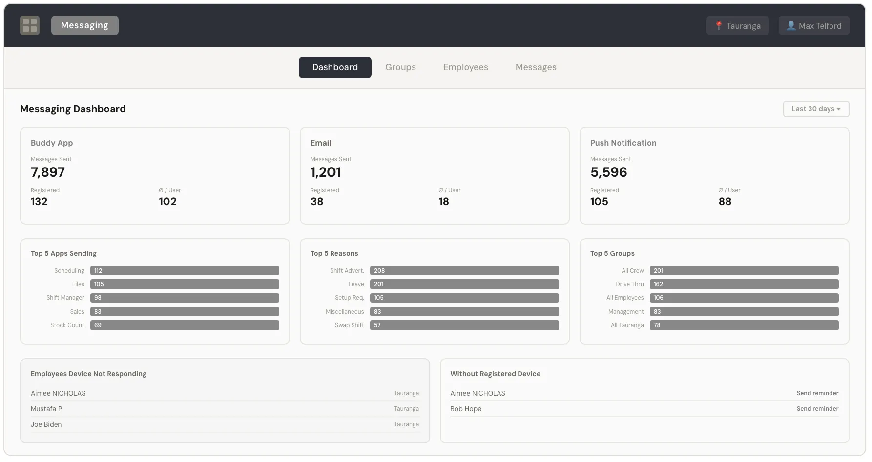
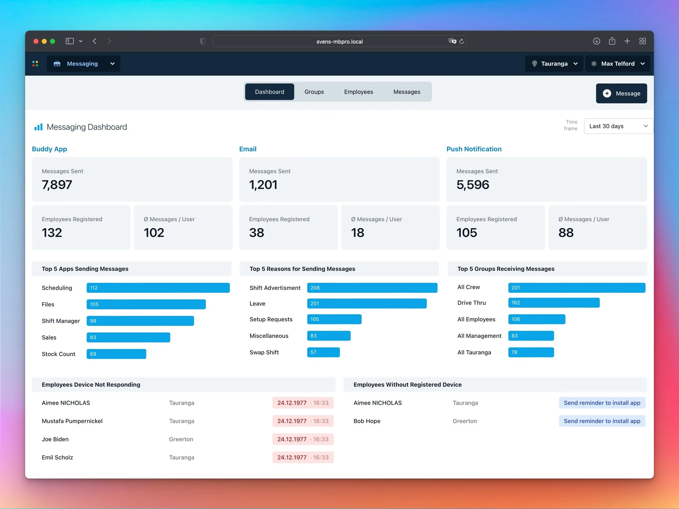
Each module had different data density and interaction needs, so the page framework adapts: Gantt-style timelines for scheduling, data tables for employee lists and requests, card-based dashboards for messaging analytics. The product serves multi-site franchisees, so location switching is always available in the header for quick toggling between restaurants.
Engineering needed a design they could implement and extend without me on call, so every prototype was built in HTML with Tailwind CSS. The markup itself stood in for a spec document — anyone could inspect a component to understand spacing, typography, and color decisions, then implement against it in the production stack.
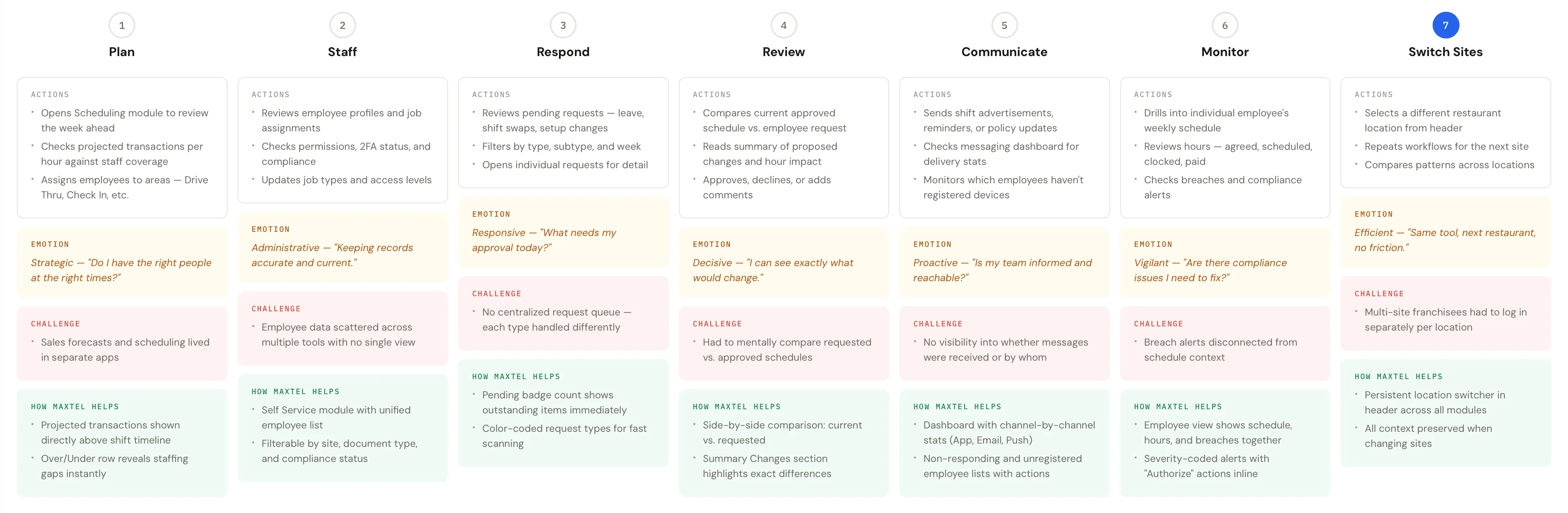
Project Goals
The project needed to simplify daily workflows for restaurant managers while giving the development team a sustainable design foundation. The three-month timeline meant focusing on patterns that could scale, rather than designing every edge case.
Goal 1 — Consolidate
Bring 5 separate web applications under a single platform with unified navigation and consistent interaction patterns.
Goal 2 — Systemize
Build the design system in Tailwind CSS prototypes that engineering can use as the canonical visual and interaction reference for the production rebuild.
Goal 3 — Responsive by default
Deliver production-ready prototypes testable on any device, ensuring the design works in real restaurant environments where managers use tablets, phones, and desktop computers interchangeably.
Key Design Decisions
Unified Application Shell Over Separate Apps
The most fundamental decision was consolidating everything under one navigation structure. The persistent dark header with the module switcher, location selector, and user context creates a stable frame that every module inherits. Managers learn one navigation pattern and carry it across all their tasks. The trade-off was that each module had less freedom to create bespoke layouts — but the consistency gain far outweighed the flexibility loss.
Tailwind Prototypes as the Design Reference
I built the prototypes directly in Tailwind rather than producing a traditional design system document — tokens, component specs, usage guidelines that would have required separate maintenance. The prototypes were responsive by default, testable on real devices, and dense enough with real markup that engineering could inspect any component to understand spacing, typography, and color decisions without a separate spec.
The actual implementation stack turned out to be OutSystems, not Tailwind directly — a fact I learned later than I should have. The Tailwind prototypes still served as the canonical visual and interaction reference; engineering re-implemented against them within OutSystems’ component constraints. See Where I Was Wrong below.
Transaction Projections Alongside Scheduling
In the previous apps, sales forecasting and employee scheduling lived in different places. The new scheduling view brings projected transaction volumes directly onto the timeline. The “Over/Under” row at the bottom makes staffing gaps immediately visible — if projected transactions peak at 13:00 but coverage drops, the manager sees it without switching tools.
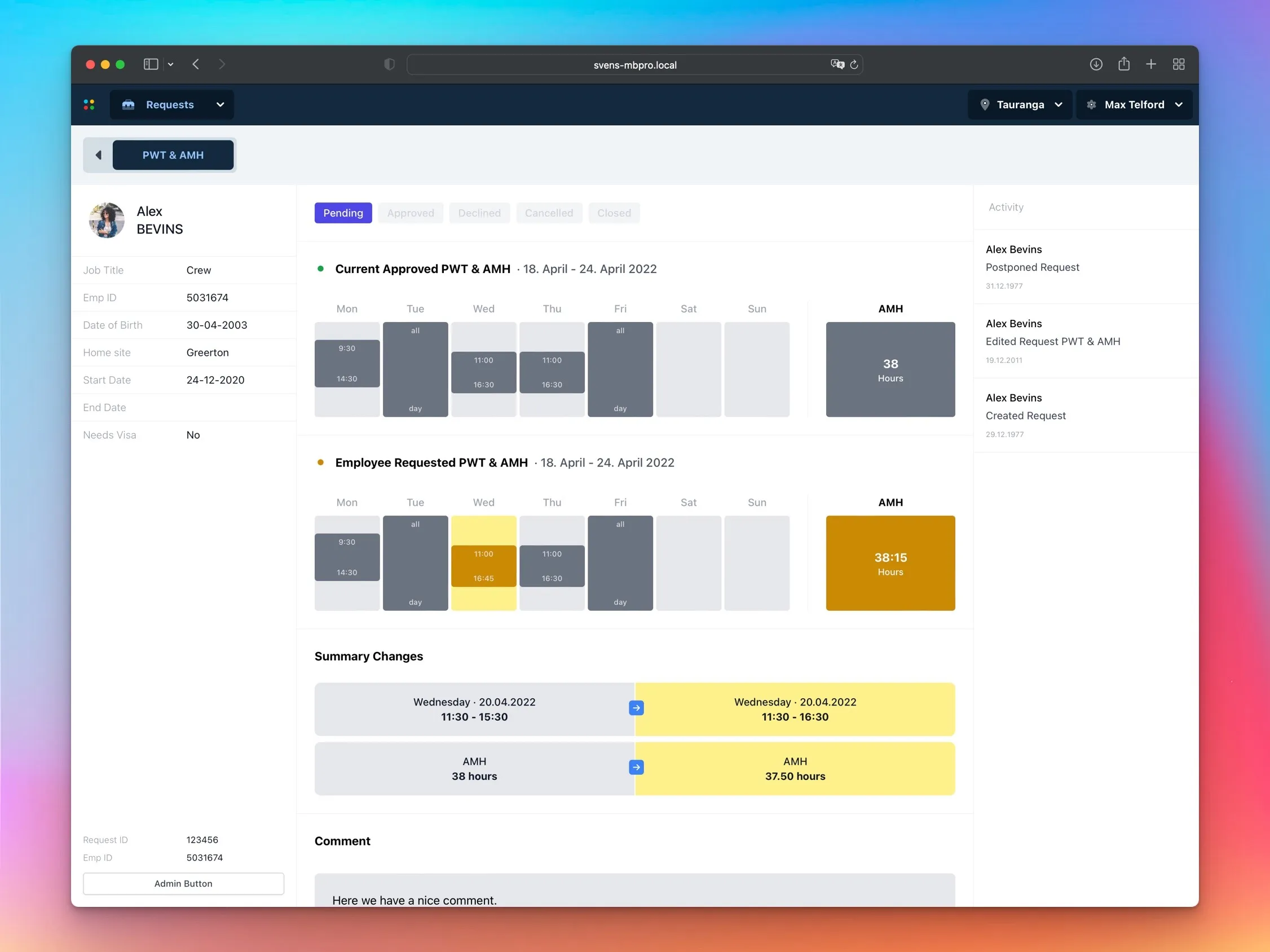
Side-by-Side Change Comparison for Requests
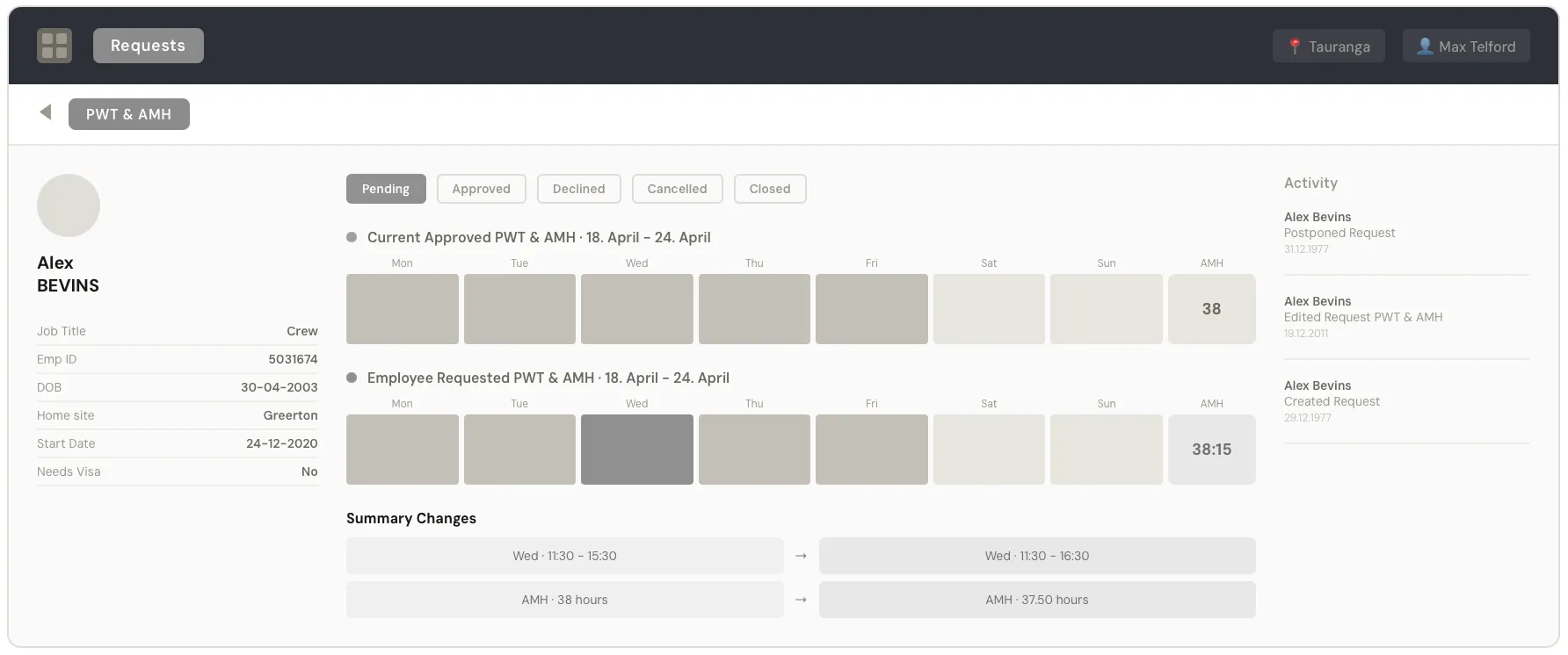
Reviewing employee requests (shift changes, hour modifications) used to require managers to mentally compare what was requested against what was currently approved. The new side-by-side layout shows the current approved schedule on top, the employee’s requested change below, with a “Summary Changes” section explicitly listing what would change and by how much. A cognitive task became a visual comparison.
UI Design
Restaurant managers work across devices — office desktops for planning, tablets on the floor, phones on the go — so the Tailwind prototype was responsive from the start. Every layout was tested across screen sizes as a primary design constraint, not an afterthought.
The previous apps all looked different, so visual consistency was the highest-priority lever. A clear component vocabulary: the dark header bar identifies the current module and provides navigation; the filter bar standardizes how data is searched and filtered across all views; the content area uses consistent card, table, and timeline patterns. Color coding is sparse and consistent — green for approved/active, red for breaches and alerts, yellow/amber for pending, blue for informational.
Scheduling is inherently visual and time-based, so the Scheduling module uses a Gantt-style timeline with employee shifts as colored bars against a 24-hour grid. Projected transactions sit above the schedule, connecting staffing decisions to business demand directly — a relationship that didn’t exist in the previous separate apps.
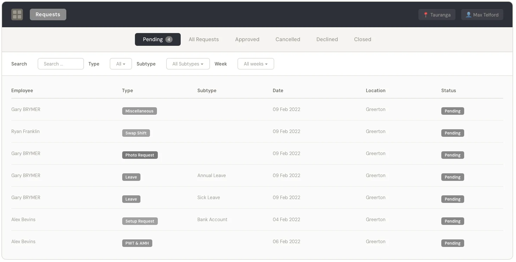
Managers need to act quickly on requests, so the Requests module uses a status-first design: primary tabs (Pending, All, Approved, Cancelled, Declined, Closed) scope the list immediately, and each request row uses color-coded type badges for instant scanning.
Where I Was Wrong
I underestimated the constraints that a low-code platform like OutSystems imposes. I didn’t know the system at the start and just prototyped in HTML and Tailwind, the way I usually work. As the project progressed I learned that OutSystems had a steep learning curve and that many components and patterns were difficult to adjust — some required custom code, others couldn’t be customized at all. The Tailwind work had to be re-mapped to what OutSystems actually allowed, which cost me time and rework. The lesson: never default to your own toolkit without asking which framework the production build will actually use.
Learnings
- Consolidation is primarily a navigation problem — the individual modules already worked; the value was in connecting them under one roof with consistent patterns.
- Tailwind prototypes are an unambiguous visual reference, but they aren’t a portable design system — the production stack still dictates what’s actually implementable. Ask which framework the team will build in before defaulting to your own.
- When redesigning multiple apps simultaneously, establishing the shell and shared components first creates momentum — once header, filter bar, and table patterns were defined, each module fell into place faster.
- Three months is tight for 5 apps — the key was focusing on patterns and systems rather than pixel-perfecting every screen.
Impact
Consolidated 5 separate web applications into one unified platform for restaurant managers who use these tools throughout every shift. The Tailwind prototypes gave the production team an unambiguous visual and interaction reference to implement against, and the responsive HTML meant the design was validated on real devices during the project rather than after launch. End-to-end timeline: three months from first conversation to complete prototype handoff.