Case Study
Loop-X
A touch-first tablet UI for Brainlab's mobile intraoperative CT scanner, designed around the realities of the operating room — sterile drape, gloved hands, time pressure, and split attention between patient, robot, and screen.
- Company
- Brainlab
- Role
- Senior UX Designer
- When
- 2021
- Domain
- Medical Device / Robotic Imaging / Regulated Software
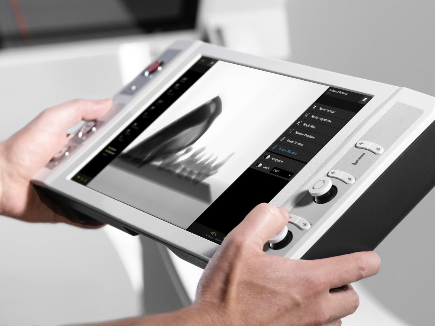
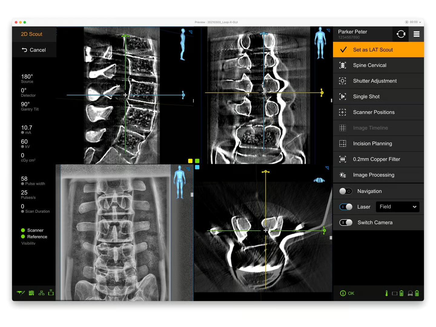
Designed the tablet software for Brainlab’s Loop-X — a robotic, mobile intraoperative cone-beam CT scanner used during spinal, cranial, and trauma procedures. Defined the interaction model for operators working under sterile drape, with gloved hands and minimal margin for hesitation.
Overview
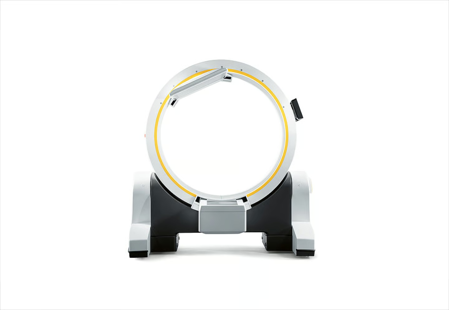
Loop-X is a robotic mobile CBCT — a cone-beam CT scanner on wheels that moves into and out of the surgical field, capturing 2D and 3D imaging during procedures without forcing the surgical team to break workflow. It’s operated via a detachable tablet running the imaging software, which clips onto the device or detaches to give the operator freedom of movement around the OR. I designed the tablet UI as my final project at Brainlab, leading the work from research through wireframes and Adobe XD prototype to developer handoff.
The Team
The design team on Loop-X was deliberately small: me as the UX designer and a UX researcher running constant testing and measurement throughout the project. We worked inside Brainlab’s broader research infrastructure — the in-house testing facility for hands-on sessions with practicing clinicians, and field observations of CBCT systems in real operating rooms — but the day-to-day design work was a tight pair iterating on the tablet UI alongside the developers building the software.
Problem
Intraoperative imaging interrupts surgery. Every minute the scanner takes to position, configure, and capture is a minute the patient is open and the team is waiting. Traditional CBCT systems made this worse with cluttered desktop-style interfaces, mouse-and-keyboard interaction patterns, and workflows that assumed an operator sitting at a console — none of which fits a sterile OR with the operator often in the field next to the patient.
Loop-X needed an interaction model built around the actual conditions: a tablet draped in sterile plastic, gloved fingers, fluorescent overhead light, attention divided between the device, the patient, and the rest of the surgical team. The software had to lead the operator through the imaging workflow without requiring deep memorization — and stay out of the way once they knew what they were doing.
Solution
I designed a touch-first interface with large tap targets, a deliberate left-to-right column flow, and a visual guidance pattern (“the light principle”) that highlights the next required action in yellow — letting the operator scan the screen at a glance and know where to look without reading. Sterile-drape compatibility, hand-with-glove ergonomics, and minimal text input drove every layout decision.
The detachable tablet model created a second set of constraints: the same UI had to work clipped to the device (close, stationary) and held in hand (mobile, at any angle). Layouts are responsive to both contexts with consistent component sizes regardless of viewing distance.
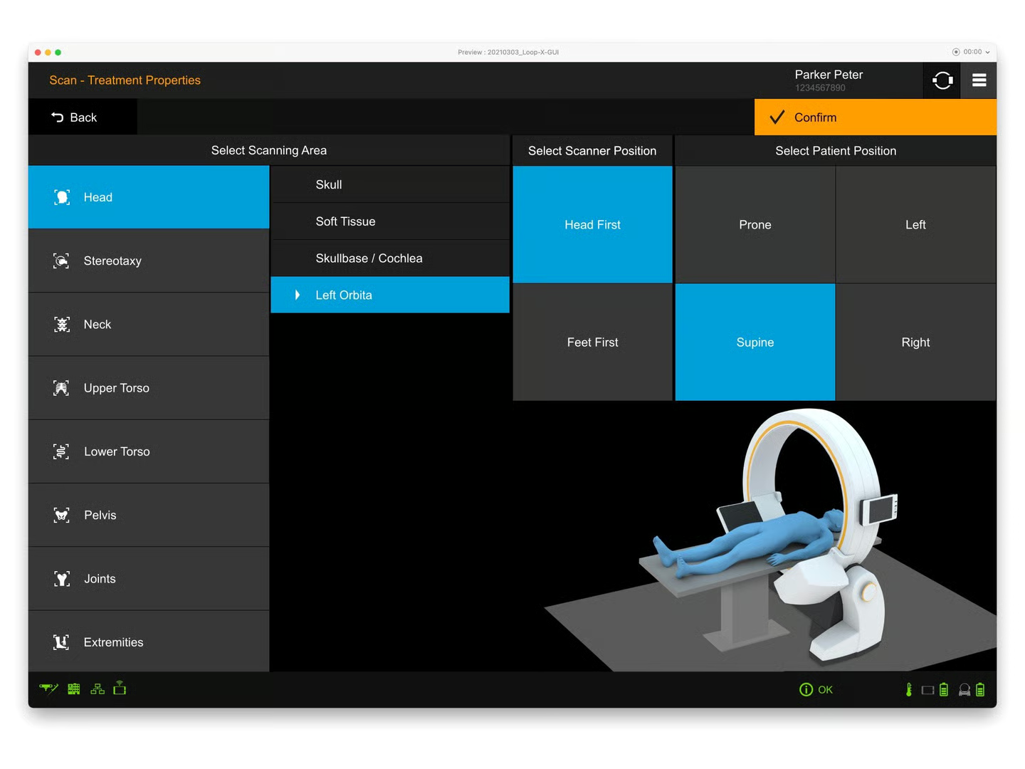
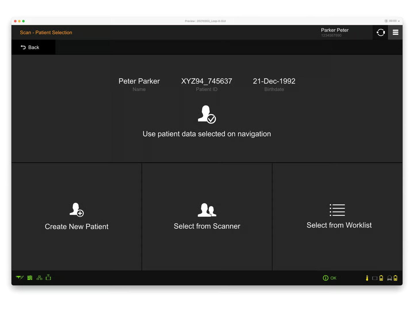
The imaging workflow itself was automated where possible — patient and scan-area selection, scout positioning, and image acquisition were structured as a guided sequence rather than a free-form configuration screen, so the operator could move through it without breaking sterile technique or surgical focus.
Project Goals
Loop-X had to be operable by a surgeon or technician in sterile conditions, complete a typical imaging cycle in less time than the previous-generation CBCT systems, and feel safe — every action with consequences for the patient or the procedure had to be confirmable and reversible. The tablet UI had to carry all of that on a single screen with no second monitor and no keyboard.
Operable through a sterile drape
Touch targets, gestures, and feedback all had to work with the tablet wrapped in surgical plastic and operated by a gloved hand.
Guide attention without requiring reading
In a time-pressured OR, operators don’t have spare seconds to parse text. The interface had to telegraph “what to do next” visually.
Automate the workflow
Where a step’s parameters were predictable from patient or procedure data, the system should set them automatically — the operator confirms rather than configures.
Key Design Decisions
The Light Principle
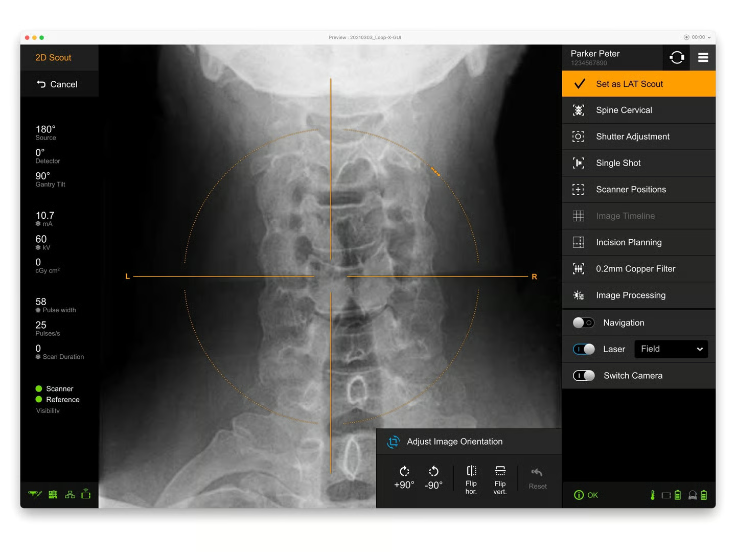
A consistent yellow accent highlights the next required action — the column or tile the operator should touch next. As they progress through the workflow, the yellow moves left-to-right across the screen. Operators learn the pattern in one session: scan the screen, find the yellow, act. No reading required.
Big Tiles, Few Options Per Screen
Patient selection, scan area, scanner and patient positioning are all presented as large rectangular tiles rather than dropdowns or lists. Each screen presents a small, fixed set of options that fit on one view with no scrolling. Gloved-hand miss rates drop dramatically with this layout.
Camera Overlay for Spatial Selection
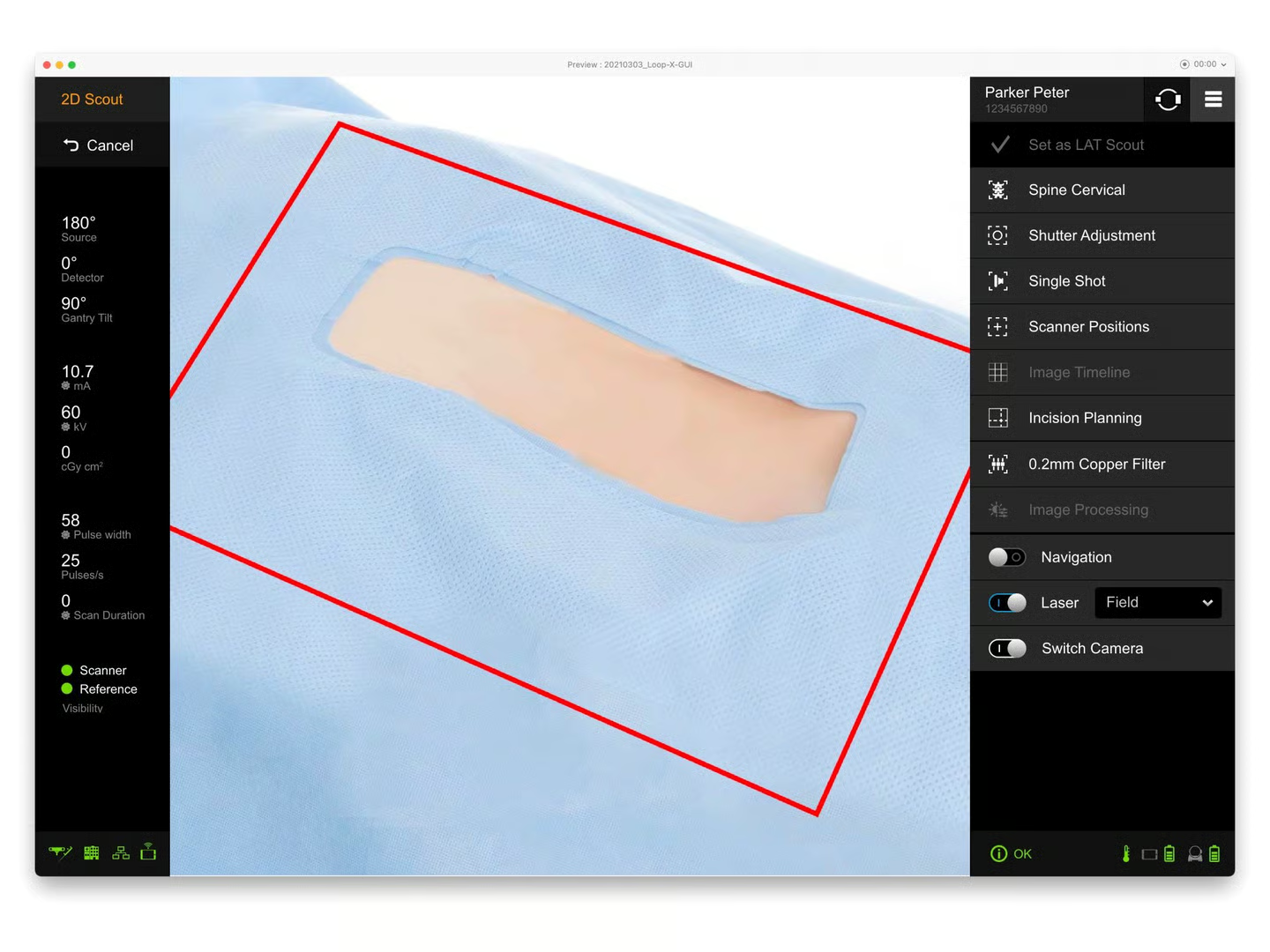
For scout positioning, a live camera feed of the patient shows the projected scan area as an overlay. Operators position the scanner by visually matching the overlay to the anatomy on the patient — a spatial task gets a spatial control, instead of forcing them to enter coordinates or sliders.
Detachable Tablet, Same UI
The tablet works clipped to the Loop-X device or held in the operator’s hand anywhere in the room. The UI doesn’t change between modes; layouts and component sizes are scaled for the further-of-the-two viewing distances so legibility holds in either context.
UI Design
The visual language follows the same principles as the rest of Brainlab’s intraoperative suite — dark background to match OR lighting, high-contrast text, restrained color use. Yellow is reserved exclusively for “next action” cues so it carries semantic weight; green confirms; orange indicates active state. Anything not in those three colors is informational only.
The component vocabulary is built around the gloved touch: minimum tap target of roughly 60×60 dp, generous spacing between targets, and no nested gestures (no long-press, no multi-finger taps). The primary “Confirm” or “Proceed” action lives in a consistent top-right position across every screen — combined with the yellow Light Principle treatment, the operator always knows where to look for the next step.
Technical metadata (gantry tilt, source angle, mA, kV, scan duration) sits in a fixed left rail, always visible but never competing with the primary work area. Operators can glance at the parameters without leaving the imaging surface.
Learnings
- In surgical software, the room is the design surface, not the screen. Sterile drape, gloves, fluorescent light, and time pressure are first-class constraints, not edge cases.
- A single semantic color (yellow for “next”) is more powerful than a full status palette when operators are working under time pressure — fewer signals to interpret means faster reaction.
- Detachable hardware changes UI sizing assumptions. Designing for the further viewing distance means the UI works in both modes; designing for the closer one breaks the mobile mode.
- Workflow automation in regulated software is a trust problem before it’s a feature problem. Every automated step still needs an obvious manual override, or the system loses credibility the first time a surgeon disagrees with it.
Impact
Loop-X ships as part of Brainlab’s surgical robotics platform, used during spinal, cranial, and trauma procedures alongside the company’s navigation systems. The tablet UI established a touch-first interaction model for intraoperative use — large tile selection, the Light Principle for visual guidance, and the fixed left-rail metadata pattern — built to work in the actual conditions of the operating room rather than at a console.