Case Study
EnerTree
A hierarchy-first redesign of a data center energy management platform for facility managers and IT operators, scaling from a single rack to ten thousand PDUs across enterprise infrastructure, delivered as a production-ready React prototype.
- Company
- Schleifenbauer Group
- Role
- Senior Product Designer
- When
- 2023
- Domain
- Industrial IoT / Enterprise / SaaS
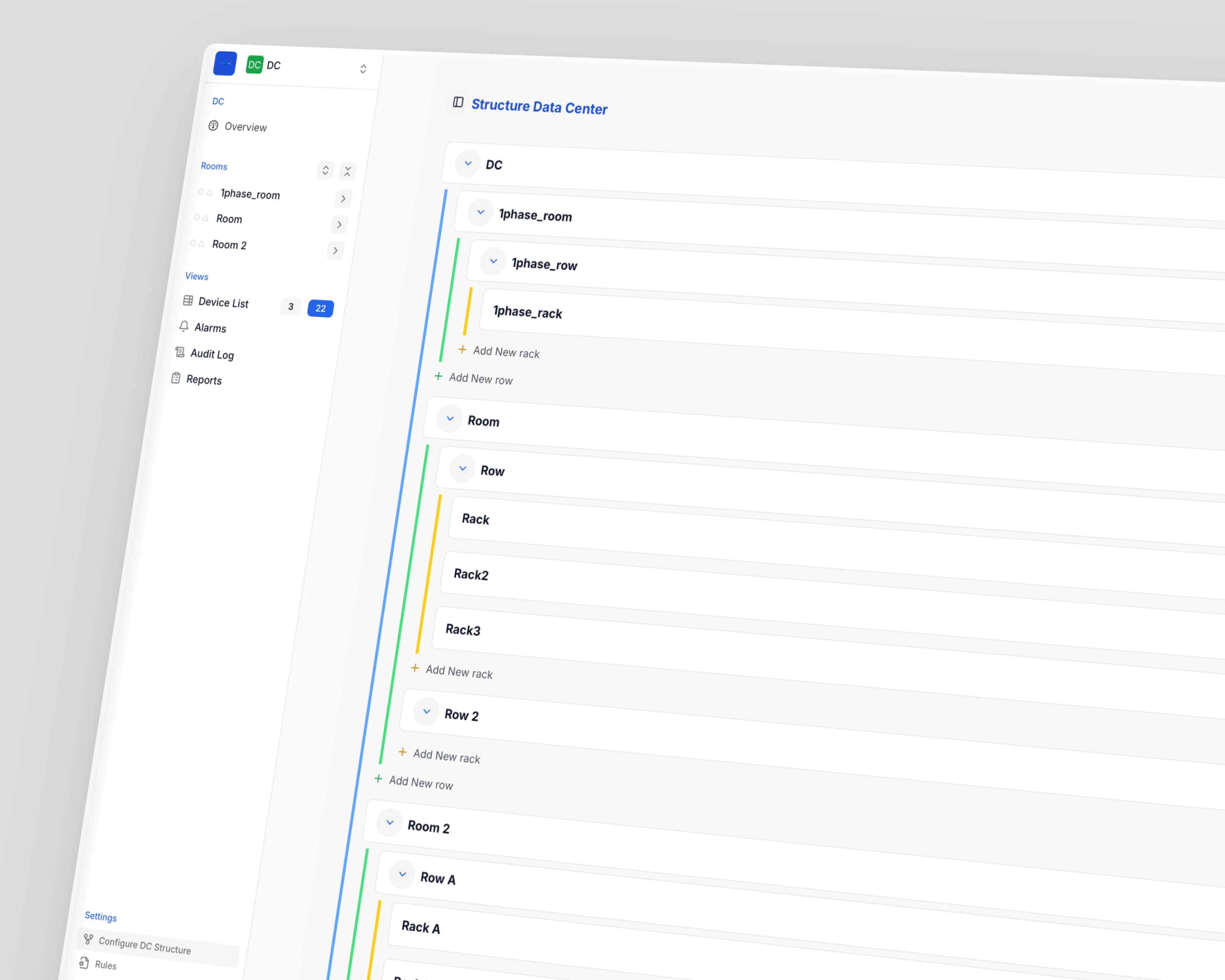
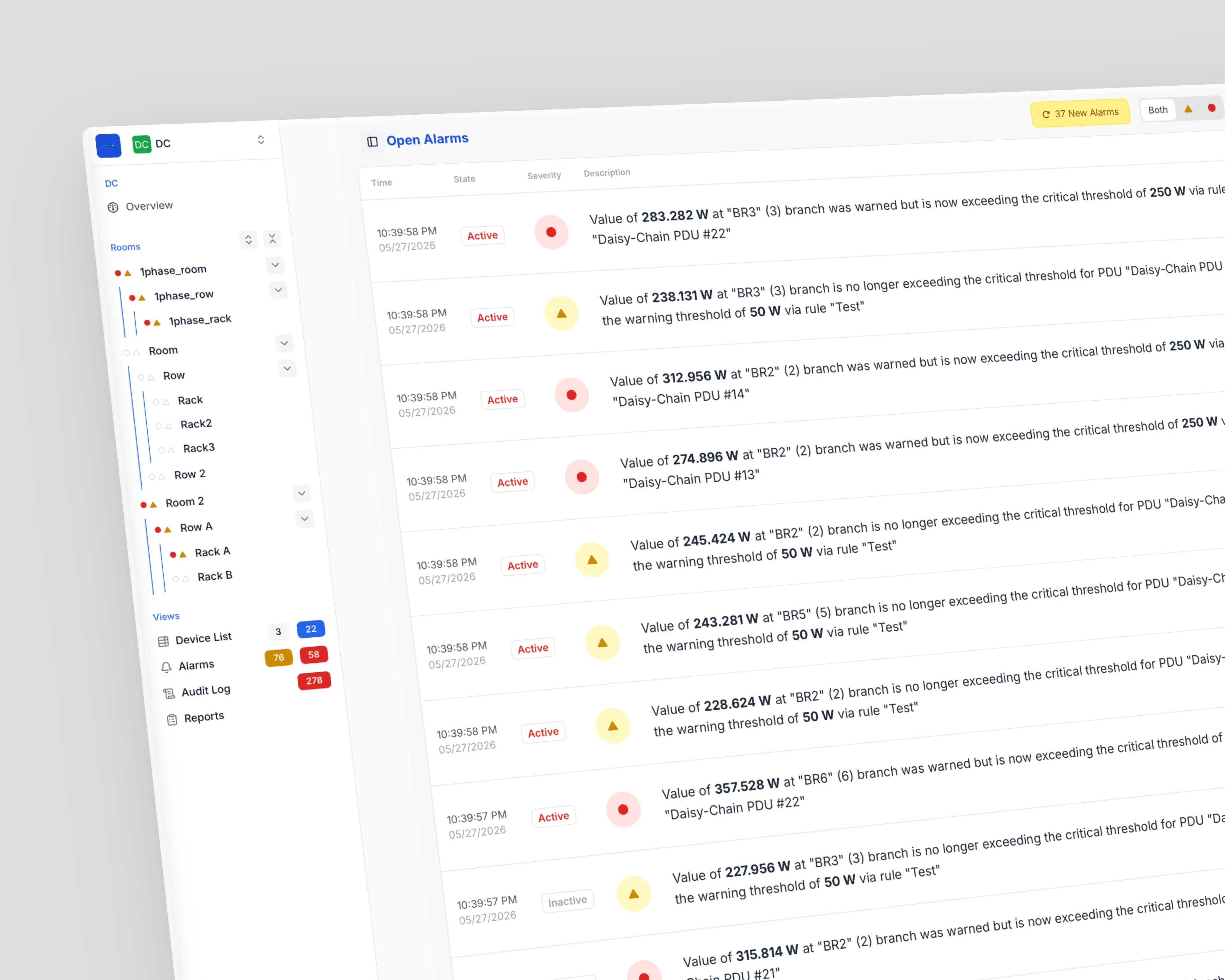
Redesigned a data center energy management platform from the ground up. Defined the information architecture, feature set, and interaction patterns for monitoring power, cooling, and infrastructure across facilities — from facility overview down to individual PDU outlets.
Overview
EnerTree is a Data Center Energy Management (DCEM) platform used by facility managers and IT operations teams to monitor power, manage alarms, and maintain infrastructure across complex environments. Data centers are deeply hierarchical — facilities contain rooms, rooms contain rows, rows contain racks, racks contain PDUs, and PDUs contain individual outlets. The previous tool flattened this hierarchy into unreadable views or buried critical information behind too many clicks.
I joined after Schleifenbauer acquired the original product my brother and I had built, tasked with a complete redesign that could scale to enterprise data centers with thousands of devices. The result is a navigation-first architecture that mirrors how operators think about their facilities, with scoped dashboards at every level. I delivered the full design as a production-ready React prototype that engineering adopted directly into the final product.
The Team
At the original Om7Sense stage, the team was me, my brother, and my father — the latter a seasoned data center salesperson whose domain knowledge made the product viable in the first place. The three of us shipped the original version. After Schleifenbauer acquired the product, the team scaled: multiple developers and a project manager on the Schleifenbauer side, with me leading the redesign and translating it into the React prototype the engineering team built from.
Problem
The previous version displayed the entire DC hierarchy in a flat, column-based layout — data centers, rows, racks, and devices all visible simultaneously in colored blocks. Everything competed for attention. There was no way to focus on one level without seeing all the others, no contextual data at each level, and no clear entry point for common tasks like investigating an alarm or placing a newly discovered device.
Operators needed to answer questions like “Which rack is drawing the most power in Room 2?” or “Where should I assign this newly connected PDU?” — but the interface required them to mentally parse the full structure every time. Alarm management was equally opaque: alerts fired but lacked the context to help operators understand severity, location, and required action at a glance. At scale, these gaps became operational risks — missed alarms, misplaced devices, slow incident response.
Solution
I rebuilt the platform around a persistent tree navigation that mirrors the physical hierarchy — DC → Room → Row → Rack — with scoped dashboards at every level. The sidebar provides spatial orientation while the main content area shows only what’s relevant to the selected scope.
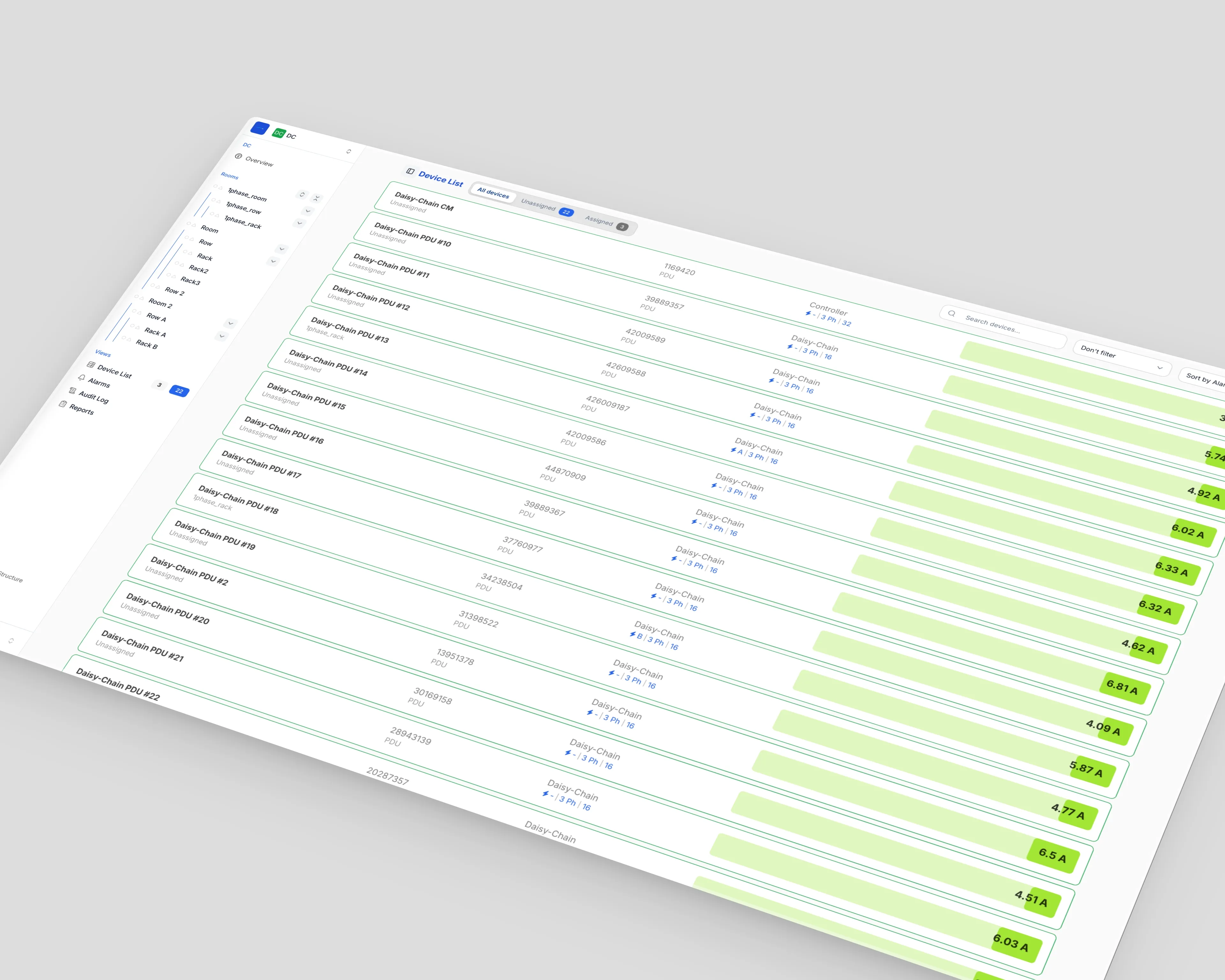
For alarm response, severity indicators, active/inactive state management, and acknowledgment controls connect each alert back to its location in the hierarchy. For new devices, a discovery flow surfaces unassigned PDUs prominently and offers clear assignment paths into the existing structure.
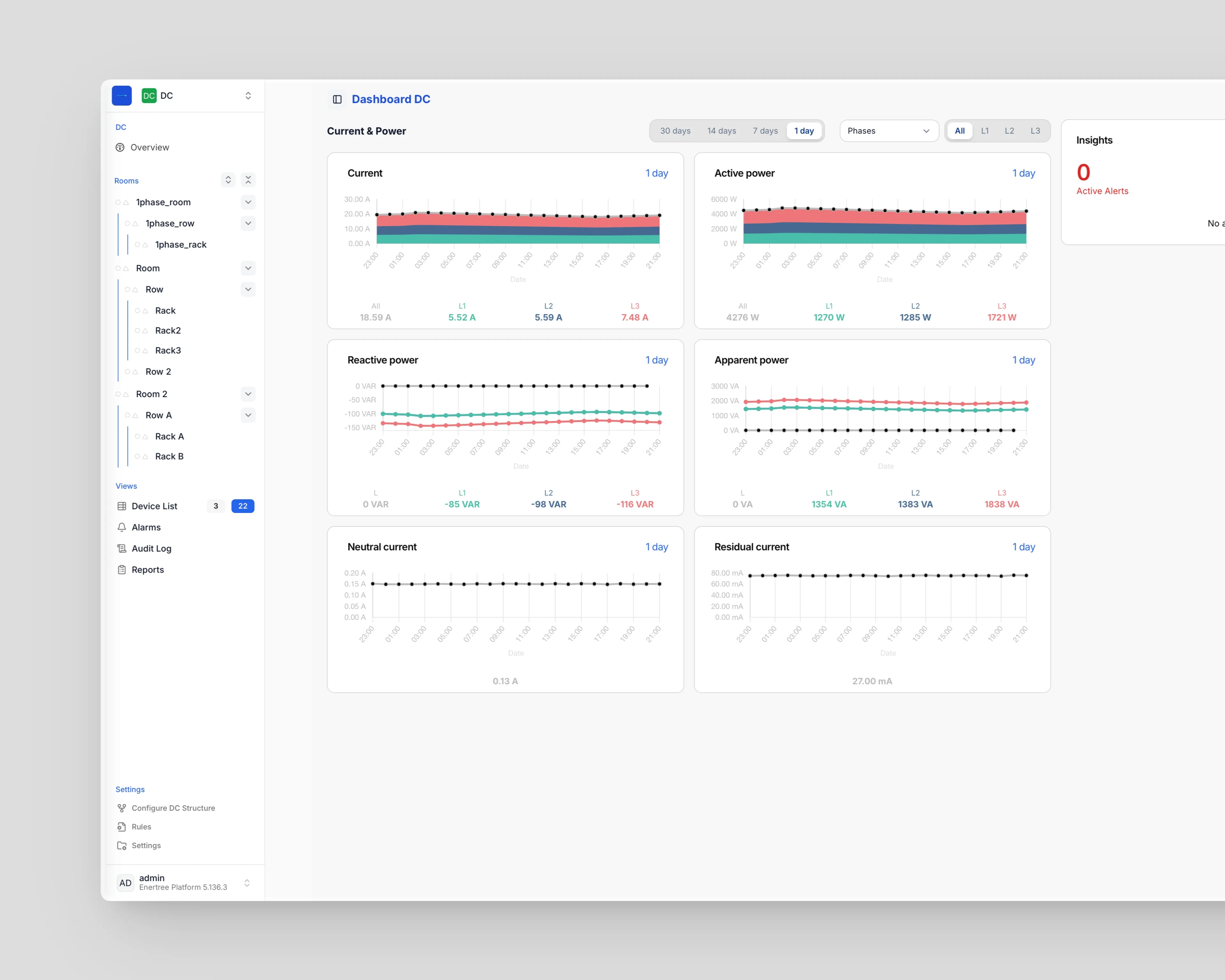
Each hierarchical level gets a purpose-built dashboard: the DC overview shows PUE metrics, power trends, and facility-wide insights; room dashboards scope down to current, power, and local notifications; rack dashboards show assigned devices with per-phase electrical metrics. Progressive disclosure prevents information overload while ensuring nothing critical is hidden.
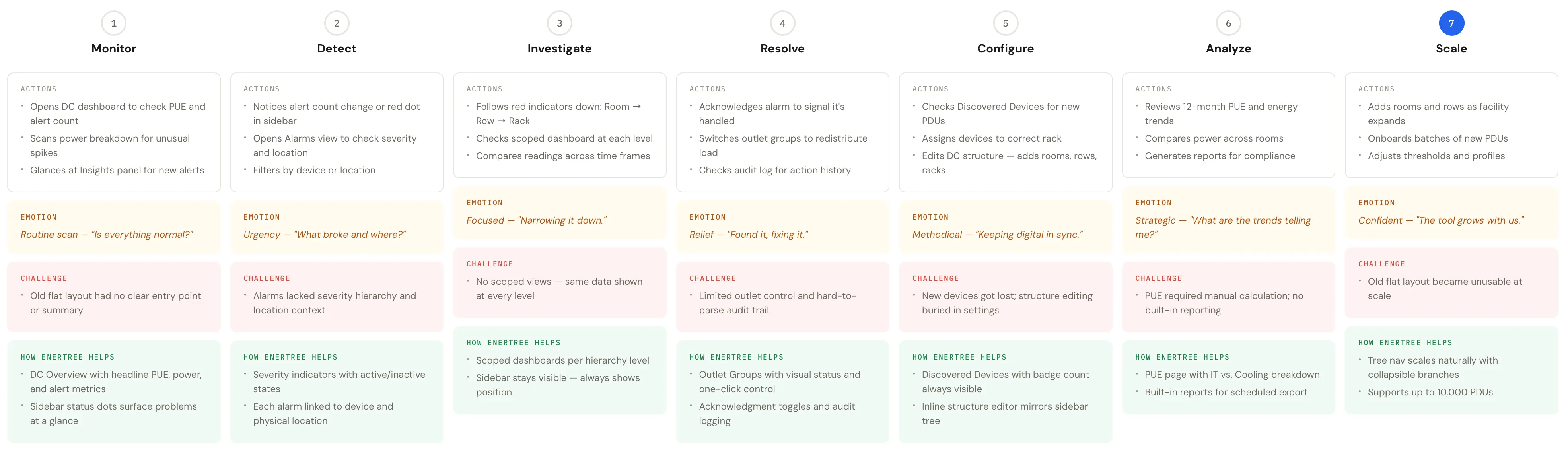
Project Goals
EnerTree needed to make a deeply technical, infrastructure-heavy domain accessible to both facility managers making capacity decisions and IT operators responding to incidents. The redesign had to replace a legacy interface while preserving the domain model existing users understood. The product ships free with Schleifenbauer’s PDU 5.0 hardware, so it also needed to serve as a competitive differentiator for the hardware ecosystem.
Make the hierarchy navigable
Operators understand where they are in the structure at all times and can restructure rooms, rows, and racks without confusion.
Surface alarms with context
Operators assess severity and take action without navigating away from their current view.
Streamline device onboarding
From network discovery to physical placement — reducing the steps and cognitive load required to bring new PDUs into the managed environment.
Key Design Decisions
Tree Navigation Over Flat Column Layout
The previous version displayed the entire hierarchy as a flat column-based view — every level visible simultaneously in colored blocks. It showed the full structure at once but created cognitive overload at scale. The persistent sidebar tree changed that: operators always know where they are, expand only the branches they’re working with, and get scoped dashboards for each level. Separating navigation from content was the single most impactful change — it turned a wall of data into a structured workspace.
Scoped Dashboards Per Hierarchy Level
Rather than showing every metric everywhere, each level gets a purpose-built dashboard. DC overview focuses on PUE, total power, and facility-wide insights. Room dashboards show current and power metrics with room-scoped notifications. Rack dashboards list assigned devices and their individual readings. Operators see the right data at the right scale, without manually filtering or mentally discarding irrelevant information.
Inline Status Indicators in Navigation
Every node in the sidebar carries colored status dots (red for alert, amber for warning) that propagate up the hierarchy. A single PDU in Rack 2, Row 1, Room 1 with a critical alert makes every parent node show a red indicator. Operators spot problems from the top level without drilling down — and when they do drill down, they follow the indicators directly to the source. The navigation became a diagnostic tool.
Editable Structure as Configuration, Not Admin
Managing the DC structure (adding rooms, rows, racks) is a routine task as infrastructure evolves, not a rare admin function. “Configure DC Structure” is a visual, collapsible tree editor with inline add/delete/settings actions — matching the mental model of the sidebar navigation. Operators restructure their facility without switching to a separate admin interface or losing context of the current layout.
UI Design
Data center operators work in high-stakes environments where a missed alarm means downtime. The interface uses a clean, low-noise design with clear visual hierarchy — red for critical alerts, amber for warnings, blue for informational data, and generous whitespace to prevent dashboard fatigue during long monitoring sessions.
The persistent sidebar tree uses status indicators at every level, giving an at-a-glance health summary without drill-down. Expanding a node reveals its children while keeping the broader structure visible.
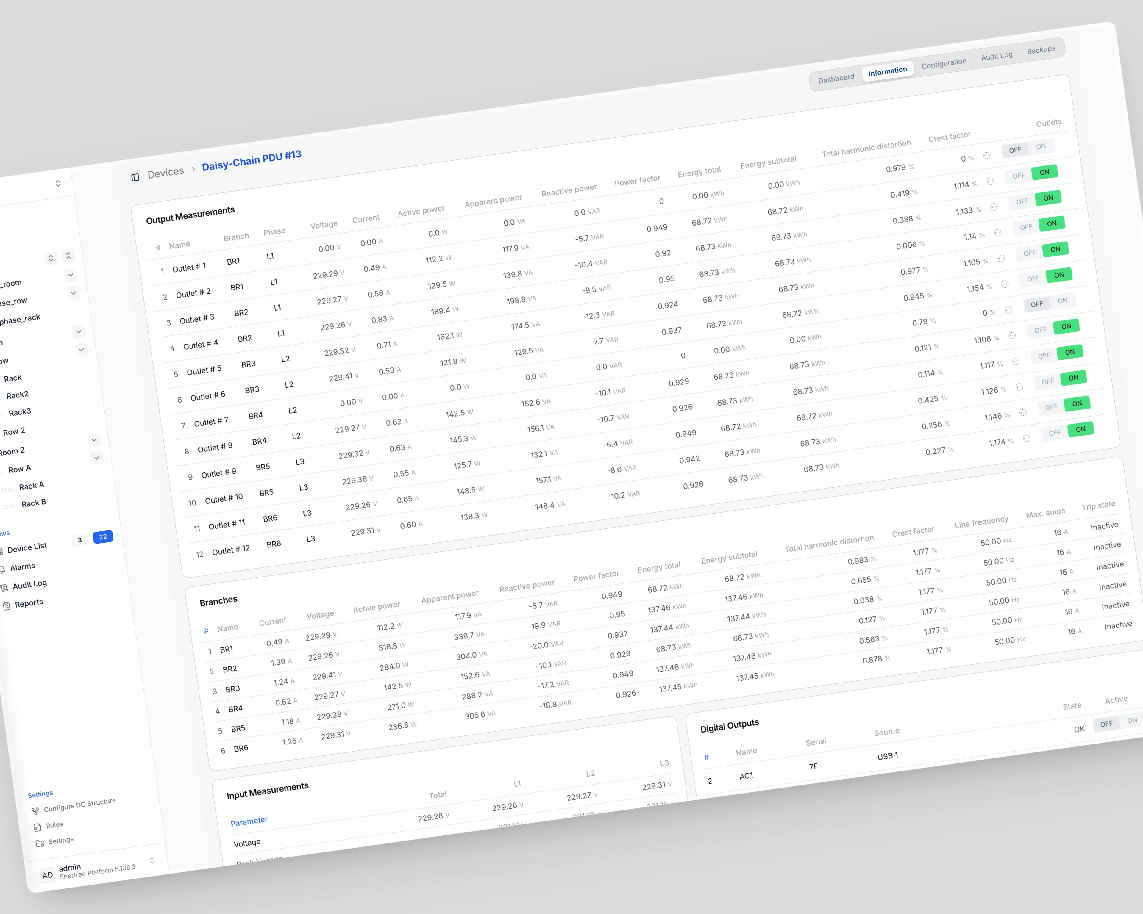
Power data is inherently multi-dimensional — current, voltage, power, apparent power, across three phases — so dashboard cards use a consistent layout: trend chart with confidence band on top, per-phase summary values below. Time frame and source (L1/L2/L3) filters are always visible.
An Overview/Feeds View toggle at the DC level separates high-level KPIs from detailed electrical data, preventing overload for managers while giving operators full access when they need it.
Where I Was Wrong
This nearly cost us the startup. In the early days when my brother, my father, and I started building the first version of EnerTree — back then called Om7Sense — we iterated rapidly, delivered working prototypes to stakeholders, and expected the sales to start flowing in. Our competitors were big, slow, and hardware-focused; we thought that gap was ours to fill.
We were wrong. The data center industry isn’t B2B SaaS. Operators manage complex, distributed infrastructure planned years in advance, with procurement built on thorough testing and trust-based negotiations — they don’t replace operational software because a new player enters the market with a better demo. Without the traditional connections and the salespeople the operators trust, you don’t sell a single license.
So we pivoted. That pivot led us to Schleifenbauer — a company that needed an operating system for their hardware and was already well-connected in the data center industry.
Learnings
- Mirroring physical structure in digital navigation is worth the investment — operators who manage physical infrastructure think spatially, and the interface should match that mental model.
- Progressive disclosure in enterprise dashboards isn’t about hiding complexity — it’s about scoping complexity to the right level so operators can act confidently at any scale.
- Delivering the design as a production-ready React prototype dramatically reduced the gap between design intent and implementation, and gave developers a working reference rather than static mockups to interpret.
Impact
EnerTree ships free bundled with Schleifenbauer’s PDU 5.0 hardware, turning software from a cost center into a competitive differentiator. The platform scales from EnerTree Lite (around 100 PDUs in small server rooms) to the EnerTree Platform (up to 10,000 PDUs in enterprise data centers), expanding Schleifenbauer’s addressable market across the full spectrum. The React prototype shortened the development cycle by giving engineers working code rather than static designs to interpret, and the product is now in production with multiple large enterprise clients.